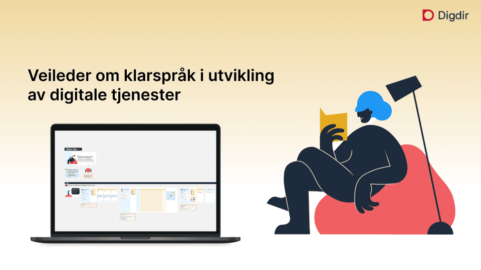
Klarspråk i utvikling av digitale tjenester
Plain Language Workshop Template
How I transformed Digdir's static plain language guide into a digital workshop tool that reduces cognitive load and makes team self-sufficient.
Role: UX Research, UX& UI Designer.
Team: 2 members (myself as the sole designer)
Platform: Miro
BACKGROUND
From static PDF to digital practise
Digdir's plain language guidelines help public sector teams create services that people more easily understand.
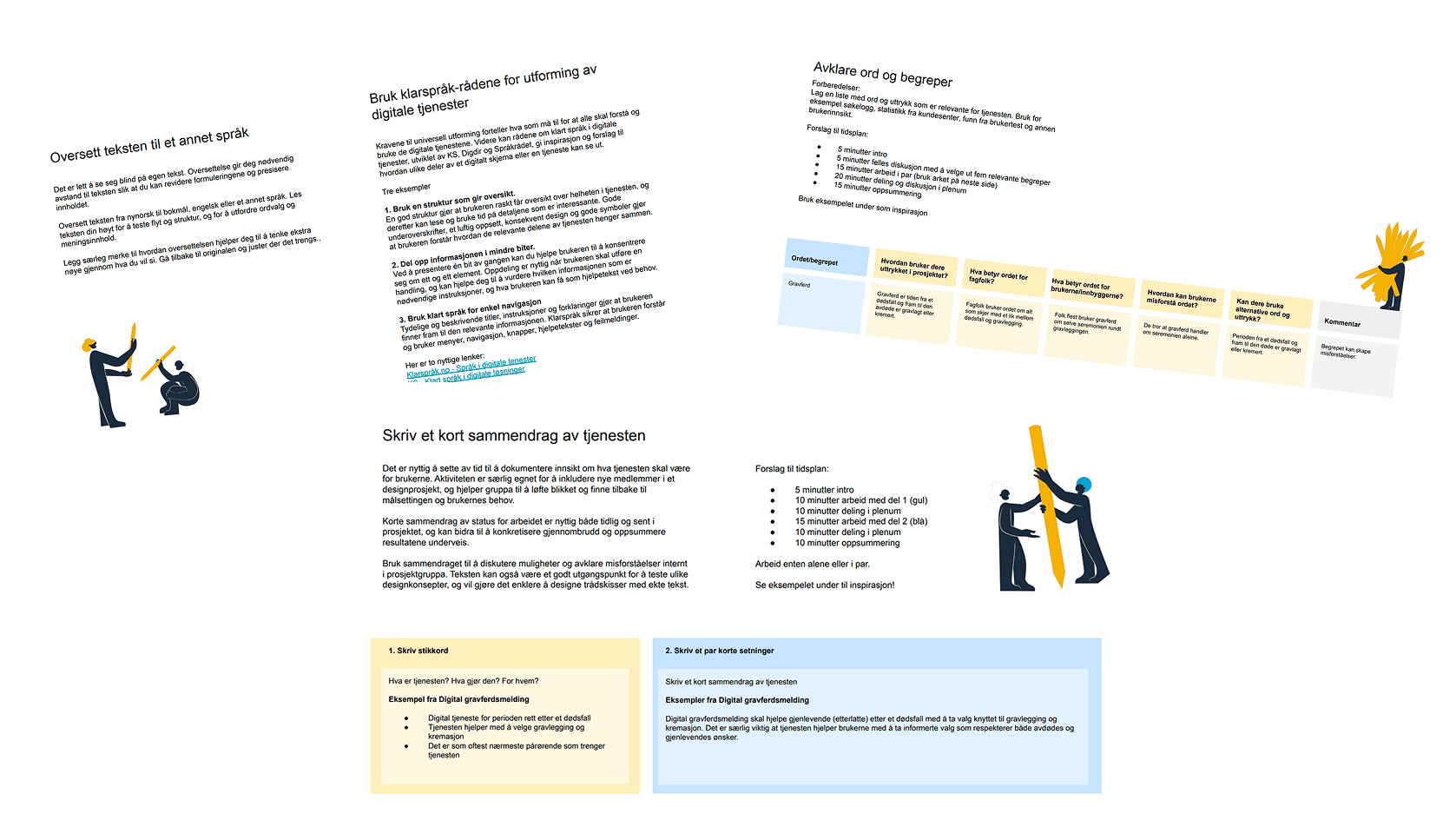
But in practice, the guide existed only as a static PDF — long, dense, and designed for physical workshops.
Many teams were already trying to use it digitally by pasting pages into Miro. The result: cluttered boards, unclear structure, and heavy reliance on a facilitator to "translate" the material.
Why this matter?
If a tool meant to support clarity creates confusion, it will be used too late or not at all.
CHALLENGE
How might we transform a text-heavy, static PDF into a workshop-ready digital template that:
→ reduces cognitive load
→ supports hybrid teams
→ guides action without long explanations
→ and preserves the integrity of Digdir's methodology?
IMPACT
Faster workshop start
Participants began working immediately
Lower facilitator load
sessions became participant-led
Clear reusable outputs
structured sticky-note logic
Better hybrid collaboration
equal participation remotely + in-room
Plain language became practice
not theory
1
Observe first — don't guess
Before designing anything new, I imported the PDF into Miro with minimal tweaks. I wanted to see how the format behaved digitally — not how I thought it behaved.
Testing insights
No time estimates → users unsure when to stop
No ready sticky notes → hesitation around contribution
Facilitator narrated every step → participants waited instead of acting
Heavy text blocked momentum
Activities felt conceptual, not actionable
Conclusion: The content wasn't the problem. The delivery format was.
2
Define — What actually needs to change?
When mapping insights, new patterns emerged:
unclear affordances (type or sticky note?)
ambiguous color meaning
long descriptions required constant explanation
participants couldn't self-guide
facilitator script too long for live use

This led to a guiding design principle:
Reduce friction. Increase clarity. Keep the method intact.
3
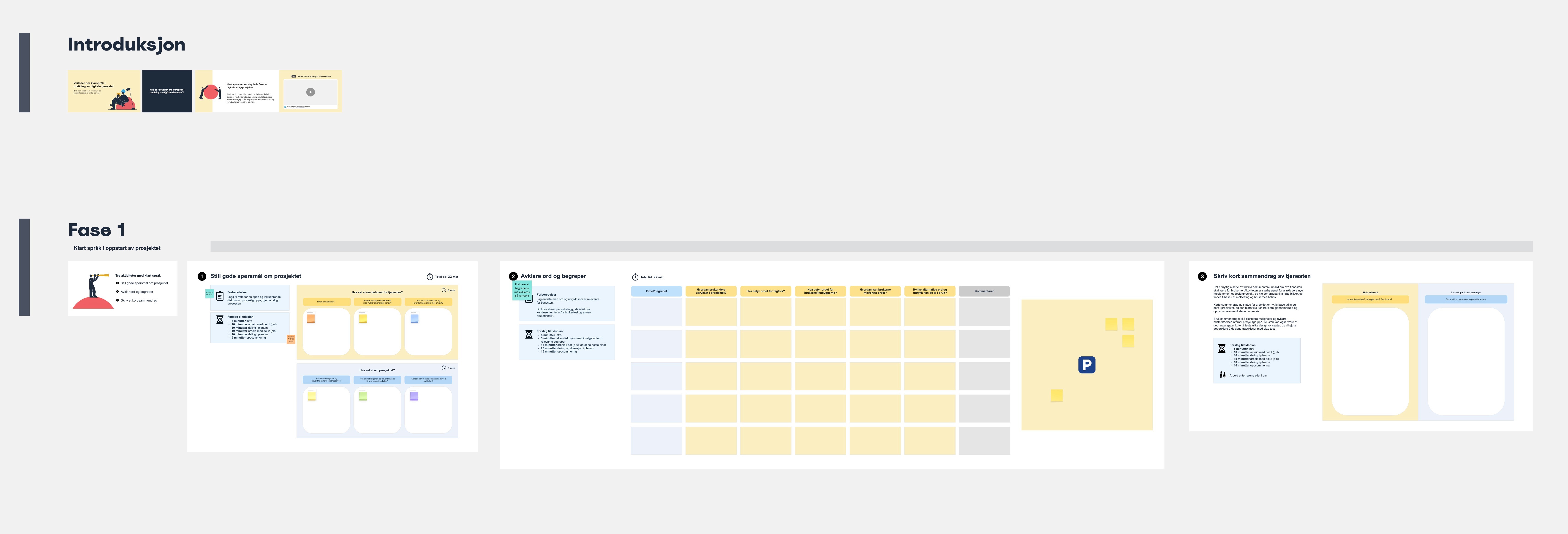
Prototype 2 — Structure improved, new friction surfaced
I introduced:
✓ Time estimates
✓ Agenda
✓ Basic facilitator guidance
Navigation improved — but new problems appeared: sticky-note usage still unclear, color-coding misunderstood, descriptions still too heavy, facilitator overwhelmed.
4
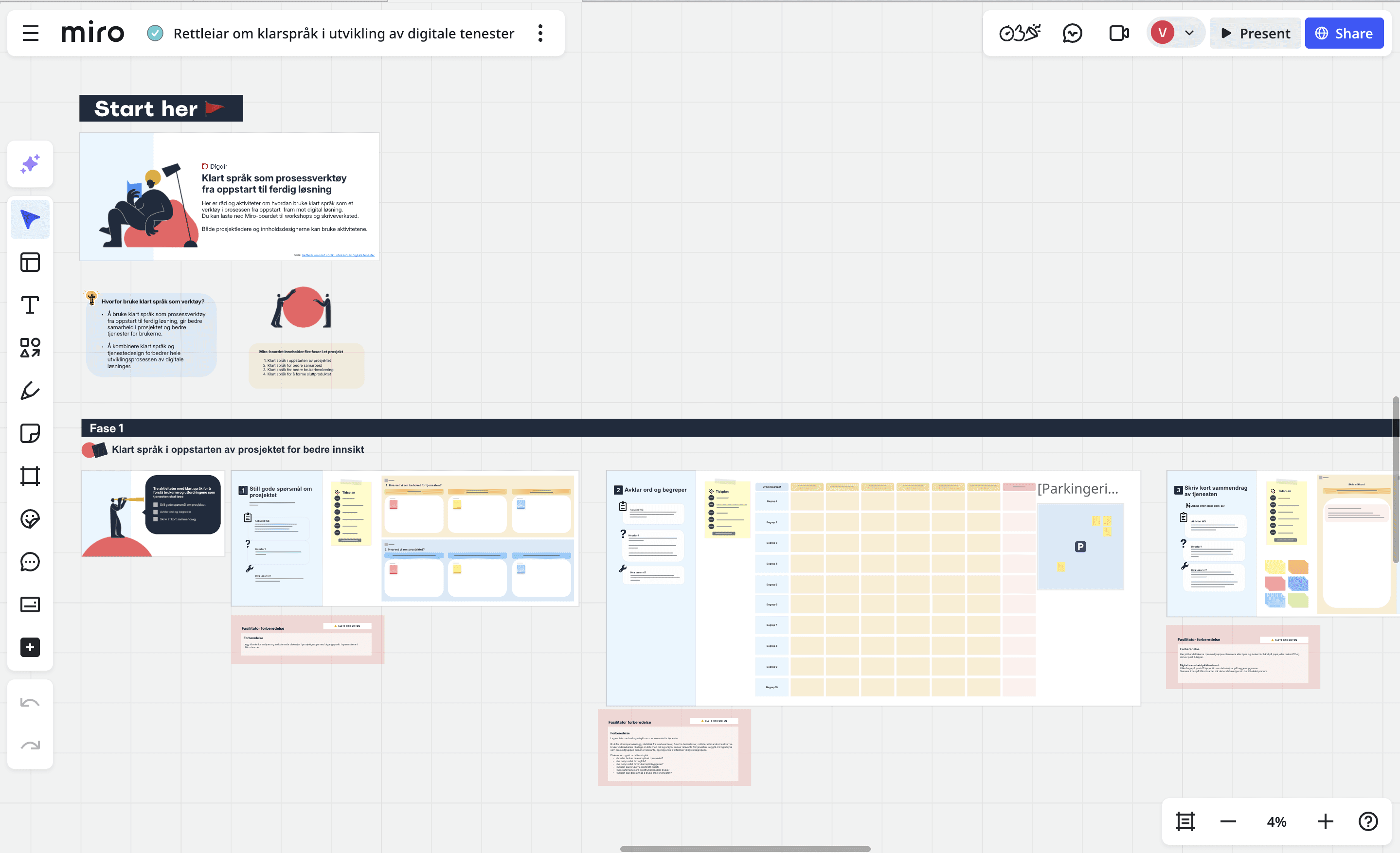
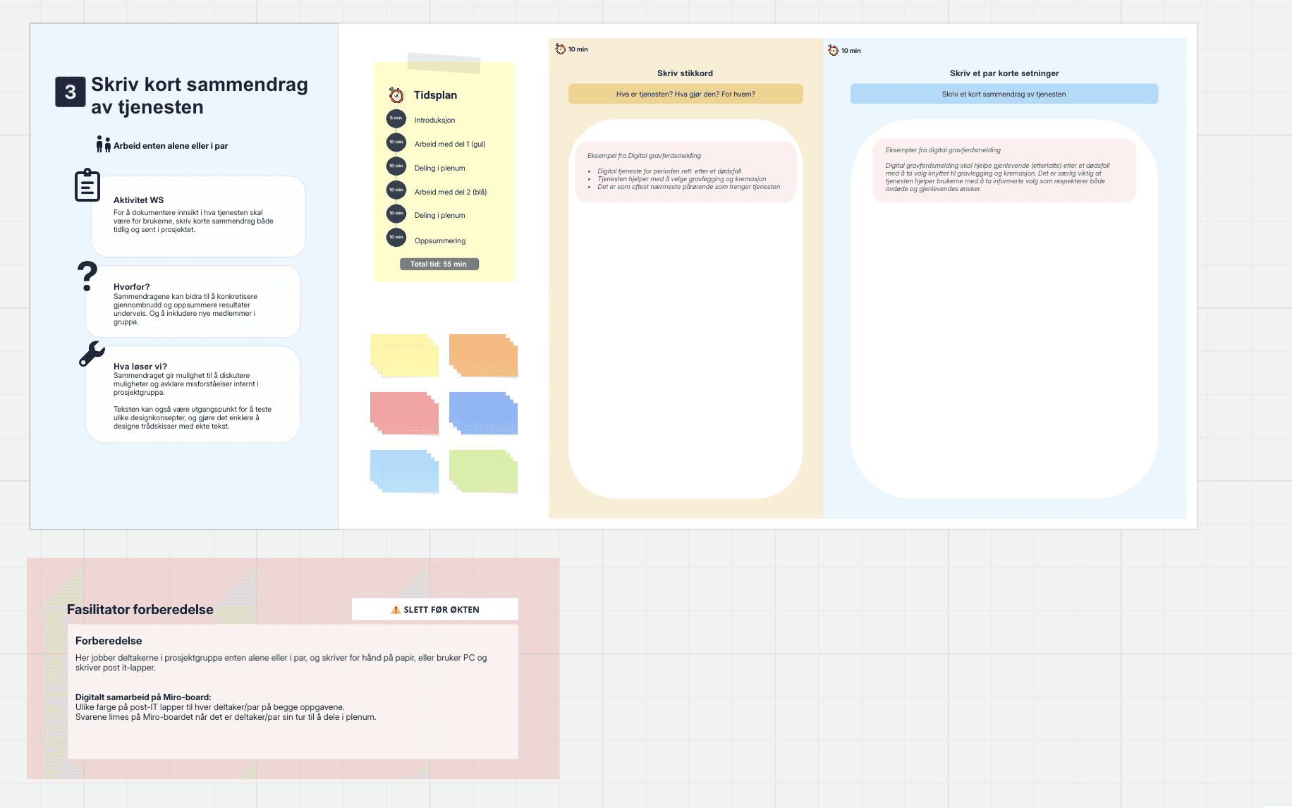
Minimal text
Each activity reduced to 1–2 short lines:
What we do
Why it matters
Expected outcome
→ Participants acted immediately
Hidden facilitator guidance
A small facilitator-only layer sits below the board. Can be reviewed before workshop → removed before session.
→ The board becomes participant-led
Structured sticky-note logic
Not per person — per activity. I tested formats: multicolor for comparison, one color for shared focus, fixed placement grids.
→ Outputs became clean and predictable
Visual identity → UX tool
Brand alignment made the board feel official and trustworthy. UI spacing and structure served as onboarding — without more text.
→ Trust from first glance
5
Testing Again — Validating Flow
We repeated think-aloud testing.
Results
✓ Participants started working instantly
✓ Flow felt intuitive
✓ Facilitator shifted from narrator → supporter
✓ Conversations focused on solving, not interpreting
✓ Template "got out of the way"
OUTCOME
The final Miro template enables teams to:
run workshops digitally without printing
understand purpose at a glance
separate physical vs digital activities
collaborate across locations
apply plain language as a live practice
Teams no longer need a translator. They simply begin.
KEY LEARNINGS
What I learned
Observe real behavior early
Even two think-aloud tests revealed friction the PDF alone never showed.
Structure drives collaboration
Micro-instructions + sticky-note logic move teams from waiting → doing
Facilitator support should be invisible
Prep belongs backstage so participants can lead the flow.
Hybrid teams need explicit affordances
Clear visual cues ensure everyone works at the same pace.
REFLECTION
Next steps
Public sector design rarely moves in straight lines — it matures through iterations.
This project taught me the value of small, strategic decisions that reduce cognitive load and invite collaboration.
My next steps are to continue testing, refine facilitator/participant modes, and support Digdir in publishing the template for national use.