Altinn Studio

MY CONTRIBUTION
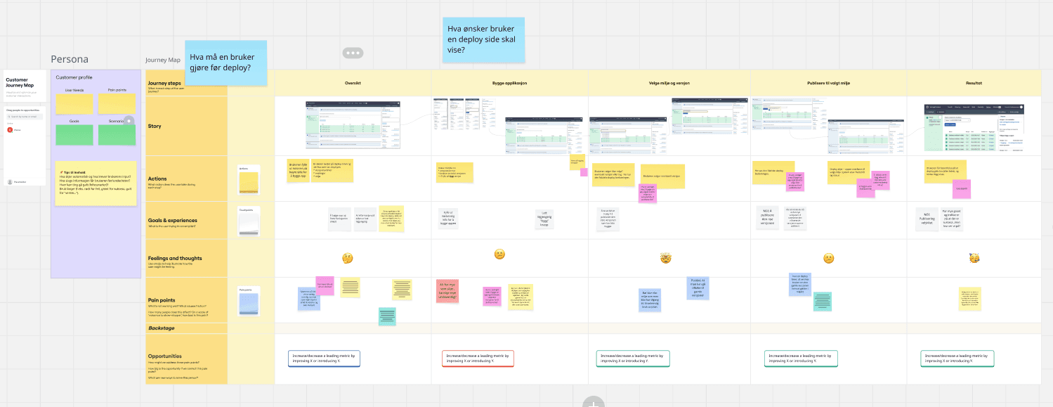
Workflow mapping · Interaction design · Validation experience · Error handling · Status communication
MY ROLE
UX Designer
TEAM
4 Developers · 2 Product Owners · UX Lead · Content Designer
TIMELINE
Aug 2025 - Feb 2026 (6 months)
OUTCOME